
Helping a Nonprofit Visualize their Data
- stellabonaparte

- Feb 20, 2022
- 2 min read
I was so pleased to work as a volunteer with the Philadelphia Youth Network to visualize some of their performance metrics for inclusion as part of their annual report. Not only did I get to work with real-world data-- they shared my love of crisp, easy to understand visualizations. I love it when a visualization can be understood within the first 1-3 seconds of looking at it!

I made maps using QGIS Geographic Information System open-source software. QGIS is very similar to ArcGIS with which I was already familiar having taken an Intro to ArcGIS continuing education course after getting my Bachelor's.
Scope of Work Time Frame: Dec. 20 – Jan. 20
Use charts, graphs, maps in order to visualize data and key impact points spanning 1-2 pages for PYN's Annual Report. Create cohesive charts that match the theme of the overall report, highlighting data points and percentages.
Preparation

1. First I reviewed and clarified project goals and parameters. I also looked at their Adobe template, read their previous annual reports, studied their brand book, and familiarized myself with charts and maps from other organizations such as McKinsey Analytics that PYN sent me.
2. Inspected the datasets for nulls, typos, blank space, and whitespace using sorts, filters, Find & Select, and formulas in Excel.
3. Imputed missing data and removed incomplete data, with approval.
Analysis

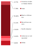
1. Summarized data in each set and converted to percentages.
2. Provided PYN with recommendations and options for chart types to best fit and present their categorical, geographic, numeric data.

3. Pivoted data to fit the desired form for each chart.
4. Created charts in Excel from the underlying pivot tables.
5. Further de-identified, summarized, and pivoted zip-code dataset, then converted results to CSV filetype.
Visualization Process
1. Transferred Excel charts to PowerPoint, resized, adjusted elements, and applied color gradients per the PYN brand book.
2. Communicated regularly with PYN liaison and adjusted chart types as requested.

3. Downloaded QGIS mapping software, learned its functionalities using tutorials on their website and Youtube tutorials.
4. Downloaded zip-code geospatial shapefiles from the City of Philadelphia’s opendataphilly.org website, an open source resource.

5. Using QGIS, I uploaded and joined the shapefile of Philadelphia zip-codes to the CSV data.
6. In QGIS, I applied color gradient, set parameters for quantiles, and added masking tools to make the numbers more visible. The map shows number of participants/zip code.
7. Finally, I exported 3 style options of the map for PYN to choose from.

Deliverables
1. PowerPoint file of 6 visually cohesive data-linked Excel charts.
2. Three choropleth maps in PDF format.
This was a great little project that was perfect for staying productive during that Christmas to New Years time period. Below is the link to their entire annual report, which I was honored contribute to, saving the nonprofit an estimated $4,324. :
I connected with this organization through a volunteer-nonprofit matching website, https://www.catchafire.org/ and I chose to volunteer for them because I believe in the mission of PYN. They work with strategic partners to create education and employment opportunities for youth and young adults of Philadelphia. What's not to love?
It was a pleasure working with them and I wish the organization continued success! You can learn more about the Philadelphia Youth Network here: https://www.pyninc.org/


Comments